The Wrong Signal

Brief Intro Note From Travis

While the Fed has 5-6 more interest rate hikes projected to get back to the projected neutral Fed Funds Rate according to the Fed’s Dot Plot, which is at the low end of historical neutral rates, the financial market is going to force the Fed to pause in their rate hiking campaign.

How?

The Fed is not going to invert the yield curve, and the market is going to force the Fed’s hand, providing a tailwind for an unexpected market development, which is the return of sustained inflationary pressures.

Thesis

The Fed will not invert the yield curve intentionally, and this reluctance will cause the Fed to settle at a lower Fed Funds Rate, at least temporarily, providing a continuation of historically accommodative monetary policy.

Setting The Stage – The Market Is Going To Force The Fed’s Hand

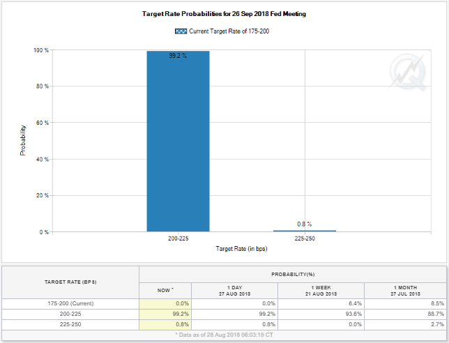
Right now, the market is pricing in a 99% chance of the Fed raising the Fed Funds Rate from a range of 1.75%-2.0% to 2%-2.25% at their September 2018 meeting.

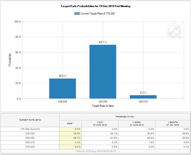
Additionally, the financial markets are pricing in a 67% chance that the Fed will raise the Fed Funds Rate an additional quarter point at their December 2018 meeting to a range of 2.25%-2.50%.

So far, so good, according to market expectations.

However, looking out a year from now to September of 2019, there is only a 37% chance, according to the financial markets, that the Fed will raise rates one more time to the 2.50%-2.75% Fed Funds Rate target range.

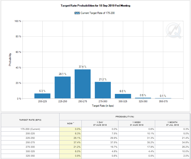
Additionally, looking at the table above, there is a higher percentage chance, according to the financial markets, that the Fed will not raise rates one single time from December of 2018 all the way through September of 2019, versus the Fed raising rates twice.

Building on the narrative even further, the financial markets are pricing in a higher probability of a cut in the Fed Funds Rate in 2019, after the December 2018 Fed Funds Rate increase, than three Fed Funds rate hikes in 2019.

Market Expectations Do Not Square With The Dot Plot

While the financial markets are current predicting three more rate hikes in total through September of 2019, the Fed’s most recent Dot Plot showed four rate hikes in 2018 (two more to go) and an additional three rate hikes in 2019.

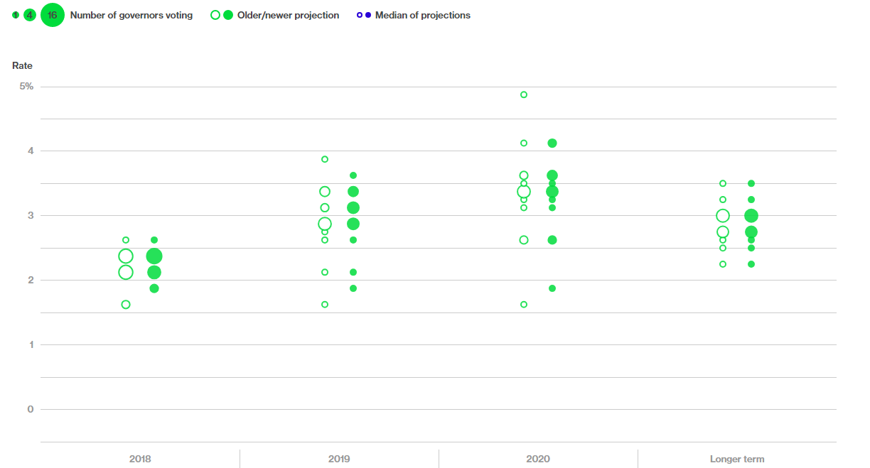
Clearly the market is much more pessimistic than the Fed’s own projections for their path of interest rates.

Why is this the case?

Yield Curve On The Cusp Of Inverting

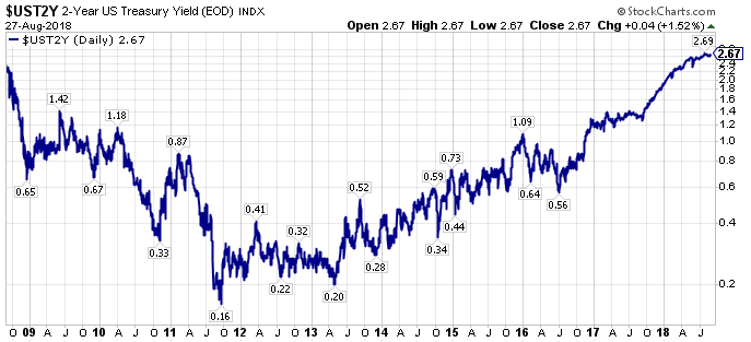
The answer as to why the market’s expectations of future interest rates is more pessimistic than the Fed’s can be found in the yield curve.

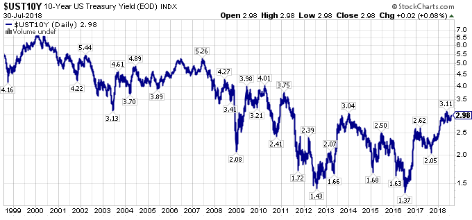
Specifically, in the United States, 2-Year Treasury Yields have kept on rising, and remain near their recent highs.

However, 10-Year U.S. Treasury Yields have retreated from their recent highs, as the fears of higher long-term interest rates that were prevalent near the beginning of 2018, have receded.

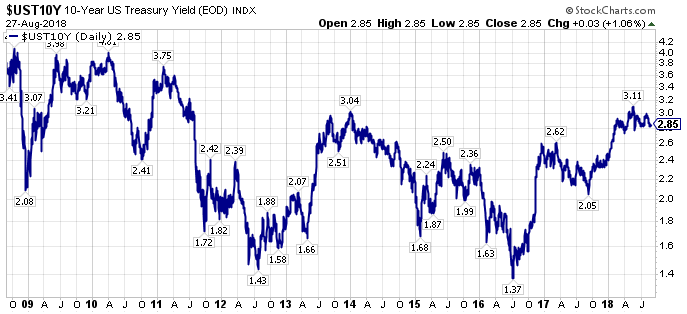
With 2-Year Treasury Yields continuing to rise, and 10-Year Treasury Yields retreating, the yield curve has flattened significantly.

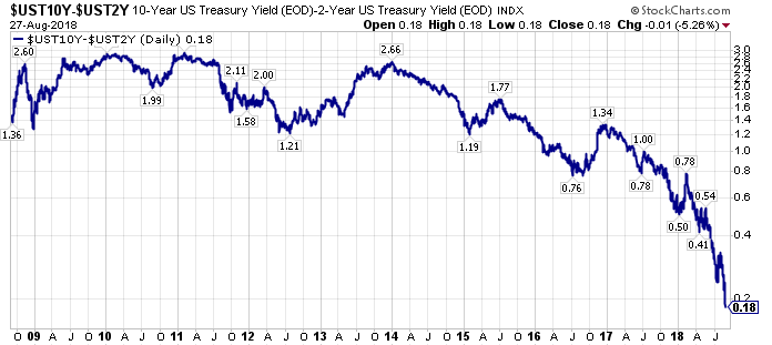
Putting it all together, market participants almost all know that an inverted yield curve has been a marker for a future recession, with a lead time of roughly 18 months.

Thus, we are in an investment landscape where most investors and speculators are casting a wary eye to the future, believing a recession is around the corner.

The Wrong Signal

The yield curve is flattening, and most investors and speculators are trying to make sense of this development.

This price action has obscured something remarkable.

Specifically, under a rules based approach, the Fed Funds Rate should be much higher.

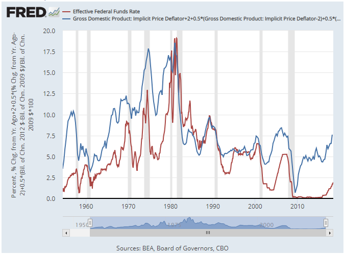
More specifically, under the Taylor Rule, which is shown in the blue line in the above graph versus the actual Fed Funds Rate in depicted by the red line, the Fed Funds Rate under a rules based approach is targeted at 7.5%.

Before dismissing this analysis reflexively because of the level of the forecast, look how closely the Taylor Rule implied Fed Funds Rate tracked the actual Fed Funds Rate from 1980-2000.

Why is the Taylor Rule suggesting such a high Fed Funds Rate?

Two answers come to mind.

First, even though the current economic recovery dating to June of 2009 (for reference the U.S. stock market actually bottomed in March of 2009) has been anemic, averaging 2.2% Real GDP Growth, which is the second-worst growth rate for an economic expansion in the post-WWII era, the extraordinary length of the expansion has provided a cumulative economic growth that is greater than most market pundits, including myself, give the market credit for, and this cumulative growth has started to register on capacity restrained barometers.

Second, economic growth has picked up noticeably with the initial readings for Q2 2018 U.S. Real GDP Growth posting a 4.1% growth rate, noticeably above the Real GDP Growth Rate in this expansion.

Adding to the narrative, Real GDP Growth is picking up further, with the Atlanta Fed GDP Now Model back up a 4.6% Q3 2018 Real GDP Growth rate reading.

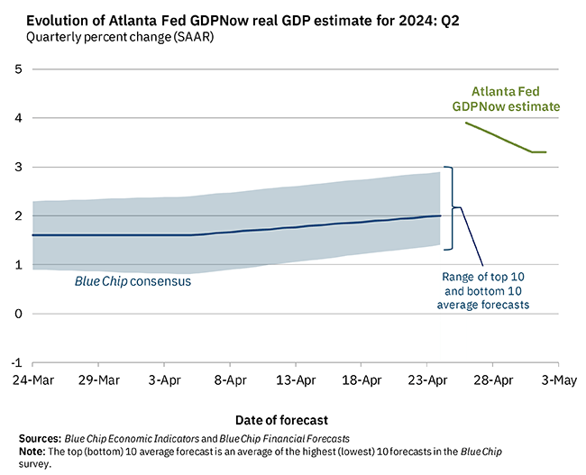
For all its criticisms, the Atlanta Fed GDP Now Model has been more accurate than the Blue Chip economists consensus forecast over the past six months, as the Atlanta Fed GDP Now Model, does not have the biases that human forecasters do, including myself, so if there as truly been a change in the growth paradigm, an unbiased model is likely to capture this change earlier.

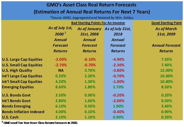
Takeaway – Market Is Mispriced

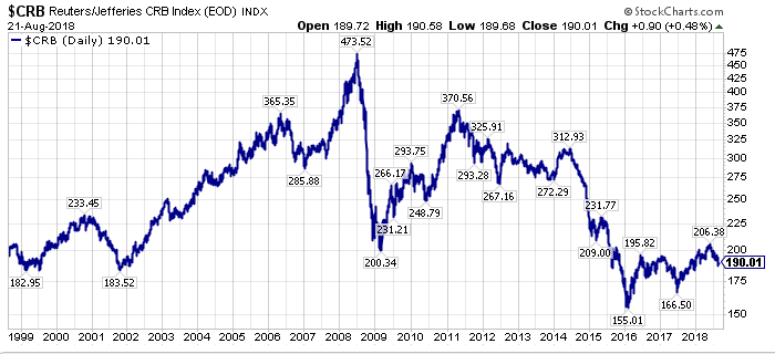
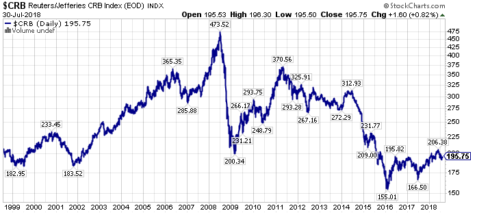
The bond market, stock market, and commodities market are priced for pessimistic growth right now.

The Fed Funds Rate futures market does not even believe the Fed’s own forecasts right now about future interest rates or economic growth.

Historically, where the Fed has been more wrong than right with their forecasts, particularly at inflection points, we can understand the market’s hesitation.

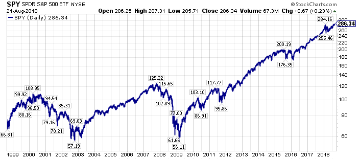
Wait, but isn’t the U.S. stock market at record levels?

Yes.

However, the U.S. stock market has become a “safety trade” for global capital flows over the past decade.

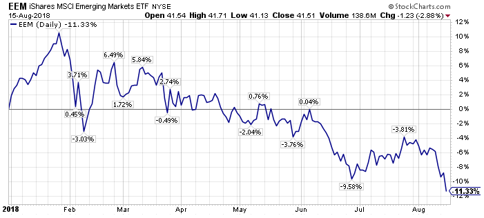
Thus, stock markets outside the U.S. are painting a different picture of performance.

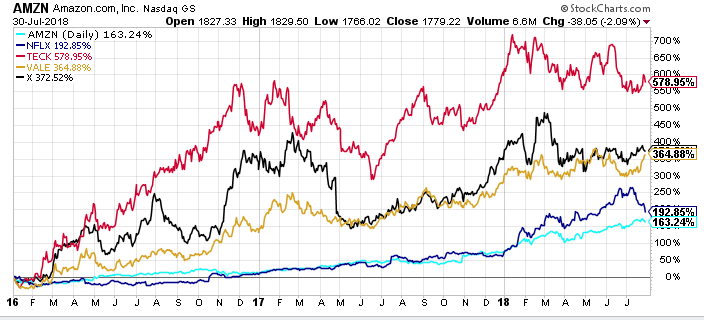
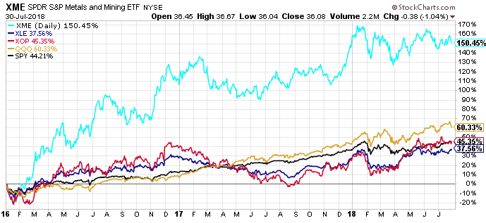
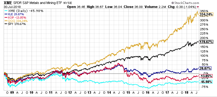
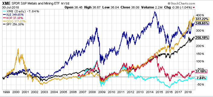
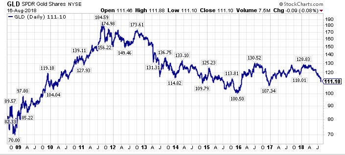
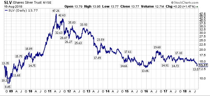
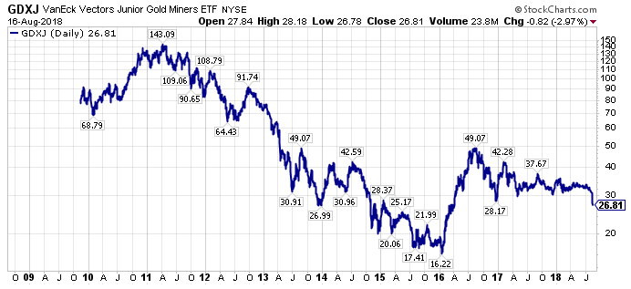
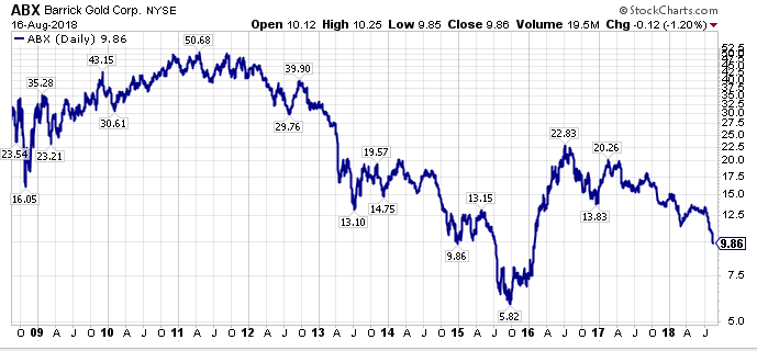
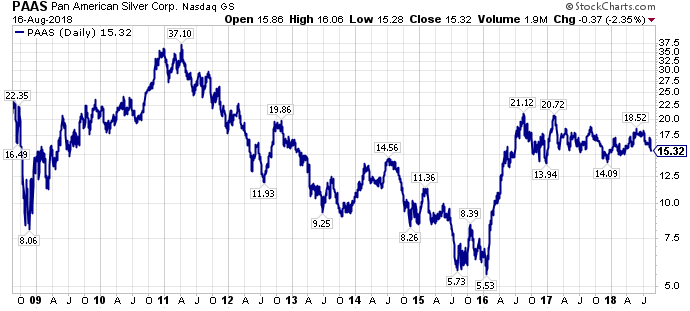
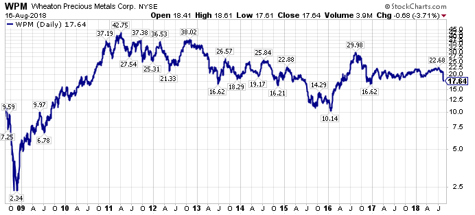
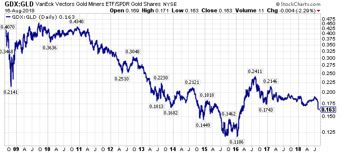
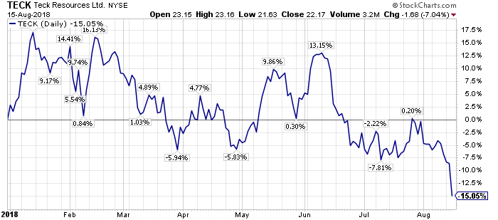
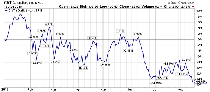
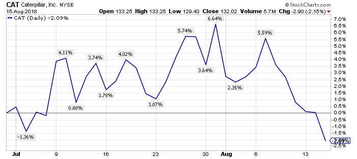
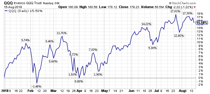
Additionally, below the surface of the U.S. stock market, economically sensitive equities, including many of our favorite targeted equities right now, have had abysmal relative, and absolute, performance over the past decade.

Why?

Economic growth has been disappointing in the United States, relative to past economic expansions over the past decade, and economic growth globally has been disappointing relative to expectations.

However, what if economic growth has finally reached a cumulative level of expansion after roughly a decade of GDP growth, that we are on the verge of triggering a traditional late-stage capital rotation?

Summarizing, for someone who nailed the potentially secular turning points in bonds and commodities in 2016, and who was rewarded for it handsomely, the last twenty months have been more difficult that almost any investing environment I have been through over the past 25 years, as there simply has not been uptake, or follow-through with regard to economically sensitive equities, particularly those value-oriented equities that should benefit the most from a turning point in economic growth expectations

The upside today is trades are more crowded than even 2016, as almost everyone believes in a uniform outcome in the financial markets, yet what if we are finally at the destination, after a very long journey, that demand is outstripping supply on a sustainable basis, and what if economic growth is actually accelerating, not rolling over?

Is the possibility of this scenario even priced in by the markets?

Even if the more modest projections of the Fed are more accurate than the markets current projections, what asset classes would benefit?

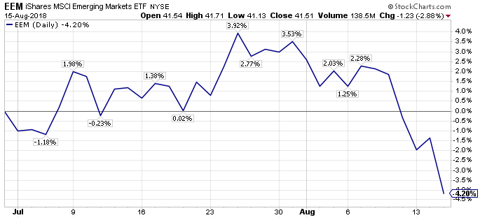
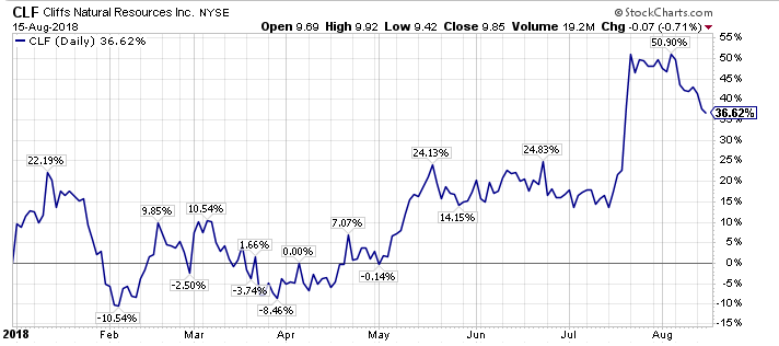
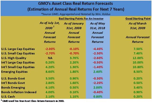
The more I think about it, the stage is set for the shunned equities of the past decade, notably commodity equities, international equities, and emerging market equities, to excel going forward.

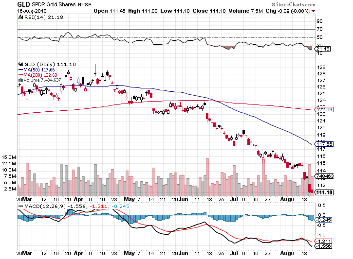
The curve-ball of July and August of 2018, when liquidity conditions were supposed to permit a rally in risk assets, yet the safe-haven assets outperformed even further, was one of the market’s financial acts of deception, from my vantage point, eschewing investors from the very trades that are set to thrive.

To close, ironically the market is setting up a scenario where the market constrains the Fed, causing the Fed, at a minimum, to pause in their interest rate hikes, and more likely causing the Fed to settle at a terminal Fed Funds Rate in this this rate hiking cycle that is much easier, in-terms of monetary policy accommodation, that past Fed Funds neutral rates.

With the market potentially constraining the Fed, forcing an easier than normal monetary policy, the odds of higher economic growth actually increase, which would further benefit the downtrodden economically sensitive equities and inflation sensitive equities, both of which have been cast aside.

Interested to see if we can get a good discussion going on this,

Travis

Potential Opportunity In Precious Metals Equities As They Are In A Puke Stage

Introduction Note Travis

Travis’s Note: This article was originally published for members on August 17th, 2018.

Volatility is certainly creating opportunity, as I opined in a recent member update, and one sector that has been crushed over the course of 2018, and particularly over the past month-and-a-half is precious metals equities.

Building on the narrative, sentiment for precious metals is plumbing rarely seen depths.

Despite the doom and gloom in the sector, many precious metals equities are poised to make higher lows than their 2016 lows, despite precious metals themselves already testing these lows.

Thus, a contrarian opportunity may be at hand.

Read on further if you are interested.

Precious Metals Equities Have Been Crushed

Look at the charts below for perspective.

First, lets start with gold (GLD) and silver (SLV).

Now on to the precious metals equities themselves, specifically the ETF’s (GDX), and (GDXJ), and Barrick (ABX), Pan American Silver (PAAS), and Wheaton Precious Metals (WPM).

In the short-term, all these charts are a series of waterfall declines.  Simply put, short-term price action has been terrible.

Longer-Term Charts Look Better

Taking a step back, and looking at the longer-term charts shows some constructive developments.

First, gold and silver are near their 2016 lows already, with silver weaker than gold by this measure.

However, the precious metals equities have generally held up better, meaning they are not as close, in percentage terms, to their 2016 lows as the precious metals themselves.

From the long-term charts above, even though we are in a waterfall decline now, perhaps nearing the end of it, but only time will tell, it sure looks like we are going to make a higher low in precious metals equities compared to the precious metals themselves.  This is a very positive divergence, in my opinion, and it is suggestive of higher precious metals equity prices.

Looking at this from another perspective, specifically the ratio of GDX (a proxy for precious metals stocks) versus GLD, shows that GDX has continued to outperform since the late 2015/early 2016 lows in precious metals equities.

In summary, early 2016 marked the end of a roughly six-year time frame where precious metals outperformed the precious metals equities.

Looking back, the failure of precious metals equities to outperform when gold and silver were making highs in 2010 and 2011 was a warning sign, and the opposite is occurring over the past several years today.

The Dollar’s Surge Is Playing A Part

The U.S. Dollar has rallied strongly in the short-term.

However, a bigger picture perspective yields a different conclusion.

Specifically, the Dollar is still below its 2015-2017 highs, which is interesting considering the risk-off emerging market sell-off, record interest rate differentials, and material out-performance by U.S. equities.

If the Dollar cannot make new highs today, perhaps all the good news for the Dollar is priced in, and this is a negative divergence?

Sentiment For Precious Metals Equities Is Abysmal

Sentiment readings are at the bottom of the barrel for precious metals equities and near the top of the range for the U.S. Dollar.

With such terrible sentiment readings, it would not take much for a significant oversold bounce to develop.

Takeaway – Trading Opportunity & Potential Long-Term Entry Point

From my vantage point, there certainly appears to be a compelling short-term trading opportunity developing in precious metals equities.

Additionally, as I wrote about earlier this year, there is long-term merit in the fundamentals for precious metals equities too.

More to come on this front,

Travis

Is The Fed Behind The Curve?

This week I was writing an article for the esteemed members of our group at WTK The Contrarian and, in the article, which discussed past interest rate cycles, and Fed monetary policy, and the future consequences of this monetary policy, I used the following chart, depicting current interest rates and what interest rates would be under the Taylor Rule.

Ever since I wrote about it earlier this week, I cannot stop thinking about this chart above.

Specifically, the Fed has been extraordinarily easy in their application of monetary policy over the course of the current bull market compared to a rules based approach, becoming even easier over the past year, as the accelerated pace of interest rate increases in the Fed Funds Rate has lagged the improvements in economic growth and in inflationary readings.

Look at the chart above again.  

What would the Fed Funds Rate be under the Taylor Rule?

How about 7.5%.

For a variety of reasons, there is no way, I repeat “no way”, we are getting there, meaning to a 7.5% Fed Funds Rate.  Adding to the narrative, this holding down of interest rates is similar to the aftermath of the 2000-2002 downturn, where monetary policy was kept extraordinarily easy (see chart above again), and this policy planted the seeds for the extraordinary price action in 2007-2010 in the financial markets.

We know what the implications of easy monetary policy in the prior era, including a historic bubble in U.S. housing prices, with the benefit of hindsight.

More importantly, what are the implications of this extraordinarily easy monetary policy today, and over the course of the current bull market?

I have some ideas, including what has spurred the record level of the S&P 500 Index (SPY) today, whose positive price action, in my opinion, is largely in the rear-view mirror, and what assets are largely undervalued given the monetary policy backdrop.  The second point is what really matters going forward, and this is especially important given the challenging level of real returns going forward.

Interested in hearing what others in the SA community are thinking?

Hope everyone is enjoying the transition from the end of the Summer back to the school year.  With more children than I can keep track of, I certainly appreciate this time of year,

Travis

Going To Bed Thinking About The Fed

Introduction Note From Travis

We have had a good discussion in The Contrarian lately regarding the Fed, specifically their pace of interest rate increases, and how close we are to the end of the current market cycle.

This has got me thinking, researching, and discussing, the end-game to this cycle over the past several days, and I wanted to put these thoughts on the proverbial paper.

Ultimately, I believe the Fed is behind the cycle, and the late-stage cycle investments are only at the beginning of their rally, with the first leg higher in these assets occurring in 2016, and the next leg higher set to commence, perhaps imminently.

Thesis

The Federal Reserve and the rest of the world’s central banks fear deflation, as 2007-2009 is still planted firmly in their minds, and thus monetary policy has stayed looser for longer, and will continue to do so, resulting in elongated investment cycles and a long runway for inflationary assets.

Fed Is Behind The Curve

On March 16th, 2017, I published an article for members of The Contrarian titled, “Market Historian – What Happens When The Fed Hikes Rates“, examining what happens to the markets in Fed tightening cycles.

Midway through the article, which looking back was very prescient (and I wish I would have followed my own rationale, reasoning, and logic better in 2017), I talked about the Taylor Rule, and posted a chart showing the differential in the Fed Funds Rate, and what the Fed Funds Rate would be projected to be under the Taylor Rule.

Back in March of 2017, the gap between the actual Fed Funds Rate and the Fed Funds Rate predicted by the Taylor Rule was pretty large, around 4%.

As economic growth in the United States has accelerated, and Fed Fund Rate increases have lagged past rate hiking cycles, that differential gap has widened further today.


With the Effective Federal Funds Rate hovering around 2%, and the Taylor Rule projecting the Federal Funds Rate should be 7.5% today (read that again and think about it) the gap between the projected Fed Funds Rate by the Taylor Rule, and the actual Fed Funds Rate has widened to 5.5%.

In summary, even though the Fed has accelerated their pace of tightening in 2018, they have actually allowed monetary policy to become looser relative to economic growth, and this easy monetary policy environment has the potential to spark an inflationary boom, which would be the best possible environment for inflationary equities, specifically commodity equities.

2004-2006 Tightening Cycle As A Comparison

The Fed has been predisposed to easier monetary policy for a long time.  The graph above would date this predisposition to around 1990, and as a market historian, I would say it began earlier, really with Fed Chairman Greenspan, particularly following the October 1987 U.S. stock market crash, where the Fed began easing interest rates immediately, after tightening them from February of 1987.

After the 2000-2002 U.S. stock market downturn, the Federal Reserve was noticeably slower to raise interest rates, waiting all the way until June of 2004 to lift rates from the 1% bottom.

Remember, 2003 was a very strong year for risk assets, so the Fed waited the entirety of 2003 and into 2004, and then they began raising rates at a steady pace.

How steady?

As I wrote in the member Market Historian article, the Fed raised rates 17 times from June of 2004 to June of 2006, which was a much faster rate hike cycle than we have seen in the current economic expansion and equity bull market.

Interestingly, the Fed stopped tightening in June of 2006, about a year-and-a-quarter before the U.S. stock market, as measured by the SPDR S&P 500 ETF (SPY), peaked late in 2007.

Adding to the narrative, commodity prices increased during the Fed tightening cycle in June of 2004 to June of 2006, adding to their advances from 2001 through June of 2004.

The price action of commodities in the chart above from 2004-2008 is of particular interest today, as I believe we are on the same path with regards to the economic cycle and financial markets today as were were back then.

Specifically, index funds dominated fund flows from 2003-2007, in a prelude to what we have seen during the current bull market, and volatility was muted, before an unwind.

It is my personal belief that the current U.S. equity bull market is sort of a hybrid between the 1990-2000 U.S. equity bull market, with growth assets dominating as I wrote about recently for members, and the 2003-2007 U.S. equity bull market, when passive flows became the go to investment vehicle for institutions on the traditional equity side.

Cycles Are Extended

With the Federal Reserve, and the world’s central banks sticking with a policy of negative real interest rates for longer than ever before, I believe investment cycles have lengthened.

From the Martin Pring graphic above, I think bonds have topped, with sovereign bonds making their secular highs (lows in yields) in 2016, so we are somewhere between Stage 4 and perhaps at the early part of Stage 5.

Keep in mind, the 4-5 year time-frame in the graphic above applied to U.S. markets historically, so again, I think investment cycles, especially on a global basis, have been elongated, so each stage of the cycle could be running 2x to 3x what is shown above.

For that reason, the current investment landscape, with large-cap growth outperforming has seemingly persisted forever.

This is the bad news.

The good news is that the other stages should be elongated too, so there should be an even longer runway for our favored late-stage asset plays today.

Investment Implications

The first thought that comes to mine is to buy iShares 20+Year Treasury Bond ETF (TLT) puts.

Why?

1.  The Fed is clearly way behind in their interest rate hiking cycle, and adding to this narrative, they may stop at a terminal rate that is significantly below what could be called for in a higher growth/higher inflation landscape.

2.  Sovereign interest rates have clearly bottomed in 2016, yet there is a reluctance to embrace this right now, and with 2007-2009 still fresh in most investor’s minds, the natural inclination is to buy bonds for a safety trade.

The second thought is that commodity equities, which have dominated the Top-Ten List, should be primed for their second leg higher.

The SPDR S&P Oil & Gas Exploration & Production ETF (XOP), which is already in the midst of its second leg higher, with the first leg occurring from the Spring of 2016 through the end of 2016, followed by a difficult pull-back for the majority of 2017, before embarking on the beginning of its second leg higher in the depths of despair in 2017, is a good leading indicator for the rest of the commodity complex today, in my opinion.

Thus, if XOP continues its uptrend of higher highs and higher lows, I think this will be a good sign for commodity equities in general, a few of which I have identified as particularly juicy opportunities, at least from my vantage point, in a recent member post titled Volatility Creating Opportunity.

The third thought that is on my mind is that the current equity bull market could go on longer than expected, as the late-stage cycle investments, have not really even gotten underway in what should be a longer than normal time-frame for late-stage cycle assets.

Having said that, projected real returns for the broader stock and bond markets are beyond abysmal today.

In summary, there really are only select pockets of value, and commodity equities are one of the sweet spots in my opinion.

Takeaway – Long Runway Still For Late Stage Assets

The Fed is farther behind in their rate hiking cycle than every before, and their glacial pace of interest rate increases in the current almost decade long equity bull market is a prime factor behind the price dislocations that we are seeing today.

Imagine for a second that monetary policy was normalized from 2009-2012.

Would we have the excesses and the imbalances that we have today?

Probably not.

However, you have to play the hand you are dealt.

Building on that narrative, the dislocations and dispersion in the financial markets the past decade is creating a Golden Age for active investors, as the supply/demand dynamics of many economically sensitive industries have been stretched to extremes, highlighting the importance of the capital cycle, and providing what I think are the investment opportunities of a lifetime.

Looking forward to what should be a dynamic rest of 2018,

Travis

Volatility Is Opportunity – August 2018 Edition

Introduction From Travis

It seems like only a short time ago, that there was a broad consensus that July and August would be positive for risk assets.

The opposite has generally been the case, with the exception of what I call the “safety trade”, which is the largest capitalization U.S. equities and indices.

While the last two months have been painful, the sell-off has created opportunities.

Taking A Look At The Summer Sell-Off & YTD Performance

This evening, I picked thirteen equities and ETF’s that span a spectrum of risk assets in the market.  They are presented as follows in reverse order of their year-to-date performance.

Number 13 – U.S. Steel (X) – Down -17.1% YTD, Down -12.9% from July 1st, 2018, through August 15th, 2018.

Number 12 – Teck Resources Limited (TECK) – Down -15.1% YTD, Down -16.3% from July 1st, 2018, through August 15th, 2018.

Number 11 – Caterpillar (CAT) – Down -14.9% YTD, Down -2.1% from July 1st, 2018, through August 15th, 2018.

Number 10 – iShares Emerging Markets (EEM) – Down -11.3% YTD, Down -4.2% from July 1st, 2018, through August 15th, 2018.

Number 9 – Southwestern Energy (SWN) – Down -8.8% YTD, Down -4.0% from July 1st, 2018, through August 15th, 2018.

Number 8 – Bausch Health Companies (BHC) – Up 0.5% YTD, Down -10.1% from July 1st, 2018, through August 15th, 2018.

Number 7 – BHP Billiton (BHP) – Up 4.6% YTD, Down -6.1% from July 1st, 2018, through August 15th, 2018.

Number 6 – SPDR S&P 500 ETF (SPY) – Up 6.5% YTD, Up 3.9% from July 1st, 2018, through August 15th, 2018.

Number 5 – Chesapeake Energy (CHK) – Up 11.1% YTD, Down -16.0% from July 1st, 2018, through August 15th, 2018.

Number 4 – Invesco QQQ Trust (QQQ) – Up 15.5% YTD, Up 4.4% from July 1st, 2018, through August 15th, 2018.

Number 3 – Cleveland-Cliffs (CLF) – Up 36.6% YTD, Up 16.8% from July 1st, 2018, through August 15th, 2018.

Number 2 – California Resources Corp. (CRC) – Up 50.5% YTD, Down -36.9% from July 1st, 2018, through August 15th, 2018.

Number 1 – Amazon – Up 61.0% YTD, Up 10.8% from July 1st, 2018, through August 15th, 2018.

A couple of quick observations.

First, the performance differential between the highest and lowest returners is particularly noteworthy in 2018.  When I used to work with Lee Ainslie of Maverick Capital, who is one of the best long/short money managers in the world, IMO, he would often remark on how wide the variance of performance was in the S&P 500 Index each year, and how this variance offered opportunity for a long/short manager.

Second, it is remarkable how strong the S&P 500 Index, and the NASDAQ have been, despite the sell-off in a large number of risk assets over the course of July, and August, thus far.

Third, earnings estimates have been rising for a number of U.S. equities, and rising earnings estimates, as we will delve into in the next section, is historically one of the factors that best influences equity prices in the near-term.

Fourth, some companies, with rising earnings estimates, like California Resources Corp, have still struggled since July 1st.  CRC’s earnings estimates are shown below.

Fifth, earnings are not everything, as Amazon has showed adroitly over the past decade.  To his credit, Jeff Bezos has focused on operating cash flow, and cash flows are ultimately a better barometer than earnings, yet earnings still matter.

Earnings & Opportunity

Amazon, which amazingly has a $936 billion market capitalization as I write this piece, has seen its shares surge higher in 2018 by 61.0%, propelled in part by rising earnings estimates, as shown in the table below.  Now Amazon’s valuation metrics are still nowhere close to what a value investor would look for, however, there is no dispute that AMZN has grown, and is growing.

Looking in the value basket of equities, Cleveland-Cliff’s, which occupied the #4 position on the June 5th, 2018 version of the Contrarian Top-Ten List, and which I wrote about in detail for members on May 30th, 2018, has risen 36.6% YTD, and 16.8% since July 1st, 2018, as earnings estimates have surged too, as the following CLF earnings estimates illustrate.

Building on this narrative, earlier today in Live Chat, I summarized a discussion I had with a former money manager over lunch, and both of us think CLF can earn over $2.50 this year (2018), so all the good news is not priced in by sell-side analysts yet, in CLF shares.

Simply judging by the stock prices of AMZN and CLF, rising earnings estimates have clearly boosted shares of AMZN, and CLF since July 1st, and over the course of 2018.

However, at the other end of the spectrum, U.S. Steel, which has seen its earnings projections for 2018 more than double from the beginning of the year, has seen its shares tumble, dropping -17.1% YTD, and -16.3% since July 1st, even as U.S. Steel’s earnings estimates have risen further, as shown in the table below.

Is this divergence, a big opportunity in U.S. Steel shares?

I think the answer is yes, as I have written about in detail in an initial profile, and in a follow-up update for members.

The same opportunity, meaning a disconnect in the underlying equity price from rising earnings estimates, is available in Teck Resources Limited, as earnings estimates for TECK are up sharply from the start of 2018, yet its stock price is down -15.1% for the year.  I am working on an updated deep-dive article on TECK.  For now, TECK’s earnings estimates are shown below.

Continuing the narrative, Caterpillar has seen its shares slide -14.9% YTD, even as its earnings estimates have been revised higher, as CAT’s earnings estimates below show.

On the mid-cap company spectrum, Southwestern Energy, which remains my top current idea for buy-and-hold investors, as SWN is compounding capital at IRR’s above 30% even at today’s commodity prices, with a market capitalization of roughly $3 billion and an enterprise value of roughly $6 billion, has seen its shares decline roughly 9% YTD, even as its earnings estimates have risen.  Here are SWN’s current earnings estimates.

In summary, I think there are four very interesting ideas across the market-cap spectrum, where earnings are rising, yet the market has looked past this good news in the short-term.

Takeaway – Focus In On Companies That Have Upward Earnings Revisions But Diverging Stock Prices

2018 has been very different than 2017, with volatility returning to the markets.  This volatility has yielded opportunities, and it should yield future opportunities, however, it has also yielded unexpected challenges.

Specifically, there have been a number of equities that have seen earnings estimates revised sharply higher, which historically has been highly correlated with rising stock prices, yet many of these equities have seen negative diverging equity prices.

Is the market trying to tell us that the earnings peak is in for economically sensitive cyclical companies?

Perhaps, however, with U.S. GDP growth just now accelerating, I believe that we are still quite a distance away from the economic cyclical peak.

If this thesis is valid, then earnings for economically sensitive companies could still be on the upswing, and there very well could be a longer runway than investors and speculators imagine, making today’s share prices bargains.

Four ideas that have my attention right now with the sell-off in shares, alongside rising earnings, are Caterpillar, Teck Resources Limited, U.S. Steel, and Southwestern Energy.

Caterpillar has a roughly $80 billion market capitalization, and a roughly $108 billion enterprise value, so it clearly is a large-cap opportunity.  Incidentally, earlier last week, when I wrote about Bausch Health Companies after its earnings, I talked about Chicago Equity Analytics, and CAT shares currently have the highest rating on their grading scale.  The one negative for CAT, would be their long-term debt.

Teck Resources Limited, which also has the highest rating from Chicago Equity Analytics, has a current market capitalization of roughly $13 billion, and an enterprise value of roughly $17 billion.  Teck, which is the second largest met coal producer in the world behind BHP, and also a major copper, zinc, and emerging oil producer is trading for roughly 3x EV/EBITDA, which is below its historical average of roughly 7x EV/EBITDA, so shares are very cheap on a relative and absolute basis.

Similar to Teck Resources Limited, U.S. Steel trades at roughly 3x EV/EBITDA, and U.S. Steel is on track to have a net cash positive balance sheet (cash minus debt) in the year ahead.  U.S. Steel is rated the second highest rating by Chicago Equity Analytics, and its traditional valuation rations, like the price-to-earnings ratio, are eye opening cheap, with shares trading at roughly a 6x P/E multiple going forward.

Despite being an iconic steel company, and a one-time market leader in market capitalization, U.S. Steel only has a market capitalization today of roughly $5 billion, with an enterprise value of roughly $6 billion.

For perspective, the current leader in market capitalization (remember U.S. Steel is former leader) is Apple (AAPL), whose shares are up 25.7% in 2018, and AAPL shares have a market capitalization today over $1 trillion.

Last but not least, Southwestern Energy, a firm that has resided atop my list of high conviction ideas for over a year, and who is generating IRR’s of above 30% at today’s still downtrodden natural gas prices, has a market capitalization of roughly $3 billion, and an enterprise value of roughly $6 billion, small for one of the United States top-three natural gas producers over the past decade, and still a top-five natural gas producer today.

Hopefully this overview will give you some ideas.  For me personally, it has helped to cement and define the unique opportunity at hand right now.

Looking forward to see the divergences resolved in a positive manner,

Travis

Growth Stocks Trouncing Value Stocks

Introduction

This weekend, I was putting together performance data (more to come on this front shortly), and the continued out-performance of growth equities was noticeable enough that I decided to pen an article for members about it.

Going back a decade, growth stocks have trounced value stocks in the United States, and the longer-term out-performance of growth stocks over their value counterparts is eye-opening.

Thus, I wanted to highlight the performance differential, to explore what it means, and contemplate how it will be resolved.

Growth Is Outperforming Year-To-Date

Compared to a historically low equity volatility year in 2017 (really almost all financial assets had low volatility in 2017), volatility has certainly picked up in 2018.  However, that has not impacted the out-performance of growth equities, yet.

Year-to-date in 2018, the iShares Russell 1000 Growth ETF (IWF) is higher by 12.3%, significantly outpacing the returns of the iShares Russell 1000 Value ETF (IWD), which is higher by 1.7%.

Looking at smaller capitalization equities, the same trends are holding true, with the iShares Russell 2000 Growth ETF (IWO) higher by 13.3% year-to-date, while the iShares Russell 2000 Value ETF (IWN) is higher by a still healthy 7.5% year-to-date through Friday, August 10th, 2018.

There is no question that growth stocks continue to lead their value counterparts in 2018.

This trend has persisted for roughly a decade, with sporadic periods of value out-performance, including most of calendar year 2016, yet these periods of value out-performance have been false starts thus far.

Growth Is Outperforming The Past Decade

Going back ten years, the iShares Russell 1000 Growth ETF has increased 215.6%, while the iShares Russell 1000 Value ETF is higher by 126.2%, which is not to shabby on an absolute basis, or even a relative basis compared to most international and emerging market equity ETF’s, yet the performance differential versus the Russell 1000 Growth is historically wide.

This performance differential persists in the small-cap arena too, with the iShares Russell 2000 Growth ETF higher by 189.5% over the prior decade, while the iShares Russell 2000 Value ETF is higher by 138.7%.

Interestingly, the performance gap between the Russell large-cap growth and value ETF’s, which stands at 89.4% over the last ten-years, is larger than the the performance gap between the Russell small-cap growth and value ETF’s, which have a 47.8% performance differential.

Clearly, the Russell 1000 Growth ETF has been positively impacted by the historic run in mega-cap growth stocks, including Amazon (AMZN), which is up 2242.9% over the past decade, Apple (AAPL), which is up 866.8% over the past decade, Alphabet (GOOGL), which is up 405.6% over the past decade, Microsoft (MSFT), which is up 397.8% over the past decade, and Netflix (NFLX), which is up a remarkable 7697.4% over the past decade.

On this note, one of my biggest mistakes in what was a wonderful 2008-2010 time period for me personally investment wise, was not identifying what was rare, which was growth, in a low growth world.

Elaborating further, I had invested substantially in the first video streaming company that I am aware of, which was Intraware, in 1999, so I saw the potential for a stock like NFLX, yet while NFLX was playing out in front of my eyes, my value bias prevented me from investing in what was a phenomenal growth opportunity.

Recent Small-Cap Out-performance Holds Clues 

If you are a market historian, you know that the best long-term asset class, in terms of performance, is small-cap value.  The Ibbotson data, which is now part of Morningstar, illustrates this clearly.

However, looking at the data above, small-cap value stocks, as measured by the Russell 2000 Value ETF, are the second worst performing group over the past decade, trailing large-cap growth equities, small-cap growth equities, and only moderately ahead of large-cap value stocks, as measured by the Russell 1000 Value ETF.

Thus, small-cap value stocks (incidentally many of our favored U.S. commodity equities, which are illustrated on the Top-Ten List, are now classified as small-cap value equities) are due for a period of out-performance, which would be in sync with the long-term Ibbotson data.

Somewhat surprisingly, given the perception of today’s stock market leadership, U.S. small-capitalization equities have out-performed their large-cap counterparts year-to-date in 2018 as shown above.

This raises some interesting questions, which I am brainstorming out loud as follows:

  1. Perhaps the U.S. stock market is not as near rolling over as believed, or as projected, as a resurgence in U.S. small-cap equities would not align with the narrative of narrowing market leadership?
  2. Perhaps we have not reached the late-stage cycle of the investment cycle road map?

For someone who has believed that the current U.S. equity market is historically overvalued, specifically even more overvalued than 1999 or early 2000, I am trying to think outside-the-box to see how the current high valuation investing could be resolved.

Look For A 2000 Repeat Of Value Over Growth

This past week, I officially turned 41, and looking back to 2000, when the Russell 1000 Growth and Value ETF’s were just formed, I am officially feeling older.

As you can see from the charts above, the Russell 1000 Growth & Value ETF’s came out in late May of 2000.  From late May of 2000, through year-end 2000, the Russell 1000 Growth ETF was down -17.2%, while the Russell 1000 Value ETF was higher by 8.6%.

From memory (the Russell 1000 Performance calculator will verify), the Russell 1000 Growth Index finished 2000 lower by roughly -22%, while the Russell 1000 Value Index finished higher by roughly 7%.

Thus, in one year, a significant portion of the growth minus value performance gap, that had built up over the prior decade, from 1990 to 1999 was erased.

Building on this narrative even further, the 2000-2002 bear market in U.S. equities, which saw the S&P 500 Index (SPY) decline by roughly 50% from peak to trough, occurred alongside a very mild recession.

Could something similar happen today?

Going even further, could we see the S&P 500 Index, and more specifically the historically outperforming growth equities, decline substantially outside a recession, or even if economic growth picks up?

Takeaway – Growth’s Run Over Value Is Getting Long In The Tooth

Growth stocks have dominated value equities over the past decade.

This has emboldened growth investors, and taken the spirit out of value investors.

The comparisons between today’s market environment, and the one that existed in the late 1990’s is apt, and this is coming from someone who was an active, contrarian value investor in both time periods.

Both growth and value investors should be on the lookout for a reversion-to-the-mean in performance.

When this inevitably happens, I think the performance-gap between growth and value investments will be bigger, in-favor of value, than it was from 2000-2002.

Turning Points Take Significant Time

  • Inflection points develop slowing, building like a kindling fire, before the flames erupt.
  • Similar to a big ship, broad market inflection points take significant time.
  • Price action continues to suggest that a major turning point is at hand, however, this has not been confirmed yet.

Intro Note From WTK

We have had two major inflection points in the broader markets in the past 20 years.  Specifically 1999-2003, and 2007-2010.  These years spanned dynamic changes in investment prices, with overvalued investments plunging while undervalued securities found a bid in both scenarios, and these selected years framed time spans where asset allocation and security selection really mattered.  Right now, I think we are in the midst of our third major inflection point in the last 20 years.

Building on this narrative, prospective future real returns for developed market equities, specifically U.S. stocks and U.S. bonds, look more dire today than they did at the beginning of 2000 or 2008.

We can go back, with the benefit of hindsight, and make fun of, or objectively criticize firms like GMO all we want for their prior real return forecasts, however doing that (the criticizing) ignores that their forecasts, and others with a valuation bent, are based on an underlying valuation methodology, and valuation still matters in the end.

Put simply, starting from one of the highest starting points in market history in terms of valuations, adjusted for record profit margins, means that an investor today in U.S. stocks and U.S. bonds has very little probability of generating healthy future returns, until the starting point is more favorable.  Going further, generating positive real returns over the next decade in the broader U.S. equity market may be a bigger challenge than many investors realize.

Adding to the narrative, it appears that we are in the midst of a secular turning point in bonds, as I have written about in-depth in my member Eye On The Bond Market series where the 35 plus year bond bull market is sovereign bonds came to an end in 2016.

The bottom in bonds, which occurred in the middle of 2016, occurred after a bottom in commodity prices, which occurred near the beginning of 2016.

So far, the potential 2016 secular bottoms in commodity prices and sovereign bonds are acknowledged, however, they are not widely embraced, as there remains a lot of skepticism and pessimism among investors and speculators.

This pessimism and skepticism is prevalent, in part, because the market leaders during the length of the current bull market have remained in-favor, with notable strength in the FAANG and large-cap growth equities this year.

Building on this narrative, large-cap growth stocks are at the tail-end of a decade long run, so it would not be surprising for the top in the large-cap growth leaders to coincide with the top of the current equity bull market.

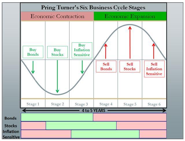
With bonds topping, equities are on the clock to top next, though given the dynamics of the current global business cycle, the topping process could be elongated to an extreme degree, a potential extension (on steroids) of the 2000 topping process.

Wrapping up this introduction, we should be in the sweet spot for inflation sensitive assets to outperform, and that has indeed been the case since January of 2016, yet right now, market leadership remains a clouded picture, so a majority of investors and speculators have not yet adapted to the new investing landscape.

In my opinion, that capital rotation recognition point is coming, and when it arrives, we should see even stronger price moves than we saw in the historic reversal and rebound in 2016.

FAANG & Large-Cap Technology Leadership – Beginning Of The End

Price action in the markets was interesting at the end of last week (when I started to write this article…I am now finishing it up Monday evening), and this interesting price action continued today.  Could we be at the beginning of a long awaited capital rotation?  Only time will tell.

Last week, the S&P 500 Index (SPY), registered its 4th straight week of gains, but market leading stocks like Facebook (FB), Intel (INTC), Netflix (NFLX), and Twitter (TWTR) showed cracks in their armor.

The selling pressure in the large-cap technology leaders escalated today, Monday, July 30th, as the following charts show.

Year-to-date in 2018, FB is now down -3.1%, Intel is higher by 4.6%, Netflix is higher by a still remarkable 74.5% in 2018 (NFLX was higher by roughly 120% at one point), and TWTR is up by 30.7% YTD in 2018, after being higher by over 90% at its 2018 highs.

Three stocks have accounted for a substantial majority of the S&P 500’s 5.8% 2018 gain through Monday’s close.

These stocks are Amazon (AMZN), Microsoft (MSFT), and the aforementioned NFLX.  AMZN’s shares are up 52.1% YTD through Monday’s close, and MSFT’s shares are higher by 24.3%.

AMZN and MSFT shares both remain in strong up-trends, thought the recent weakness in the NASDAQ, and in large-cap technology stocks, has hurt the relative strength of both equities.

Ultimately, the Invesco QQQ Trust (QQQ) is still higher in 2018 by 12.9% as of this writing, down from its earlier 18% gains, yet still higher than the comparative return of the S&P 500 Index (up 5.8%) or the Dow Jones Industrial Average (DIA), which is up 3.4% in 2018 YTD.

Will 2018 resemble the technology peak of 2000?

There are certainly similarities, with loved market leaders that couldn’t possibly decline substantially (could they?), and a decade of growth out-performance in the rear view mirror.

Commodity Stocks Still The Intermediate-Term Leaders

As strong as FAANG equities, particularly Amazon and Netflix have been, they still trail the best performing commodity equities since the start of 2016, as the following chart illustrates.

Stocks like Teck Resources Limited (TECK), which is Canada’s largest natural resource company, Vale (VALE), and U.S. Steel (X), have outpaced the performance of AMZN, and NFLX shares by a wide margin, which is saying something.

Now, not all commodity equities are up to the same degree, and some energy equities are even lower, however, this is a opportunity, in my opinion, as commodities, and commodity equities are the broader market’s performance leaders since the start of 2016.

The Takeaway – Commodity Stocks Remain Insanely Cheap On A Relative & Absolute Basis

Despite the secular bottom in commodities, commodity equities, and sovereign interest rates in 2016, and the out-performance of commodity equities, particularly base metal stocks, as shown by TECK, VALE, and X earlier, and also by the SPDR S&P Metals and Mining ETF (XME), illustrated in the first chart below, since the start of 2016, commodity equities have struggled in the bigger picture.

Looking back over the past 10 years, the performance of XME, the Energy Select Sector SPDR Fund (XLE), and the SPDR S&P Oil & Gas Exploration & Production ETF (XOP), which have returned 28.9%, -13.1%, and -46.0% respectively, have dramatically trailed the performance of SPY and QQQ, which have delivered total returns of 178.7%, and 334.2% respectively.

Widening the lens even further to 20 years, reveals something even more interesting.

Specifically, the large-cap energy equities represented by XLE, think the Exxon’s (XOM) and Chevron’s (CVX) of the energy space, have kept pace with the QQQ, as XLE has returned 349.7% over the last 20 years, slightly trailing QQQ’s total return of 377.2%.  Both have outpaced the S&P 500 Index, which has returned a not too shabby 256.1% total return over the last 20 years.

Thus, large-cap energy equities have excelled, while their smaller capitalization brethren, as represented by XOP, have struggled mightily, though the small-cap energy equities have outperformed the base metal and mining equities of the XME.

Looking at the performance data, there is a clear value delineation, ordered by market capitalization in the commodity equity universe.

This is why a stock like Southwestern Energy (SWN), which remains a top-five U.S. natural gas producer (and one of the most undervalued equities in the market today IMO), yet SWN has clearly been part of the Have Not group of equities, as evidenced by its market capitalization, or Cleveland-Cliffs (CLF), which I also believe remains very cheap on a relative and absolute basis, yet CLF shares remain extremely out-of-favor, remain so attractive.

These are the quintessential value stocks of today, the proverbial REITs of the late 1990’s.

It is easy to forget now, but entering the year 2000, technology stocks had ruled for the prior decade, and they started the year strongly.

Does that sound like the past decade to you?

It should.

What happened next.  Well technology stocks topped in March of 2000, and the Russell 1000 Growth Index (IWF) went on to lose roughly -22% for calendar 2000, while the Russell 1000 Value Index (IWD), which had trailed in performance for the prior decade, actually delivered a positive return in the year 2000, gaining roughly 7%.

The performance difference was even greater in the smaller capitalization equities.

Value is due for a period of performance like this versus growth, and the key question is what are the best value stocks today.

Could the best value stocks actually be the downtrodden, out-of-favor commodity equities?

I think it is more likely than most market participants think.

Looking forward to a good discussion on this topic,

Travis

Wilt Scoring 100 Points In A Game Is A Once In A Lifetime Event

Charlie Bilello put together a good piece that looked at the shortfall in GMO’s approach, yet I think the takeaway is a bit misguided.

Specifically, I am going to use an analogy to paint a picture and make my point.

Wilt Chamberlain once scored 100 points in a basketball game.  This was an extraordinary set of circumstances, and it took an extraordinary performance, yet Wilt set the all-time NBA scoring record for most points in a game by a single professional basketball player.  To me, this performance, was equivalent to the 1999/2000 U.S. equity market.  Everything had to play out in a certain way for the event to occur.  Building on the narrative, I never thought we would see something equivalent.

Yet, over the course of the current bull market, from March of 2009 to today in the United States equity market, the extraordinary set of events and circumstances has happened on an even larger scale, and to me, it is the equivalent of someone scoring 120 points in a basketball game today, topping Wilt’s record.

Could someone score 120 points by themselves in a NBA basketball game today when very few professional NBA teams even score 120 points in a game on a regular basis?

Yes, they certainly could, if everything lined-up, yet it would take an even more extraordinary set of circumstances and events.

Would you bet on someone scoring 120 points in an NBA game today?  Probably not, as it is a very low probability event, and no matter the payoff, and how you scaled your bets, betting on a NBA player scoring 120 points in a game would likely lose money, unless something very unusual happened.

Tying this all back to today’s markets, the run over the past decade is something that hardly anyone could see coming, yet just because it happened, this does not mean that we should bet on this sequence of events happening, nor, if we could go back in time, should we have bet on the sequence of events unfolding as they have done.

What has played out in the U.S. equity market was always an extremely low probability event.

Just because that event happened, that does not mean that the forecasts of valuation centric market historians like GMO should be thrown out for having no predicative power.

Rather, we should all strive to understand the uniqueness of what has happened.

In my opinion, the opposite is happening, as the wrong lesson is being taken away, specifically that we are better saying we “do not know”, which is true in a way, but it is encouraging investors and speculators to bet on low probability outcomes.  Additionally, the takeaway and the conclusion is encouraging investors to ignore valuations today, since if we got a historic run of equity returns over the past decade, why could it not continue?

The reason that the historic run in equity performance in the U.S. cannot continue, is that much like basketball, there are rules to the game.

In basketball, the rules include a time limit, only a certain number of possessions, etc., so there is a theoretical maximum amount of points that can be scored, even under ideal circumstances.

These mathematical limits also apply to the markets, meaning there is only a certain amount of capital in the capital markets, companies can collectively only reach certain market capitalization’s, etc., so even under rare, extreme, ideal outcomes, equities can collectively only appreciate so far, as they too will have mathematical limits.

Have we reached the limits in today’s U.S. equity valuations?

This is impossible to know, yet what we do know, is that we have had a unique set of events to get here, including U.S. domination in technology, global capital flows being recycled to the United States, enormous stock buybacks, record low interest rates, and last, but not least, a historic move from active to passive investing, which has concentrated capital in the market’s biggest companies.

The better lesson, in my opinion, is to recognize the uniqueness of what has happened, appreciate it, and say that is unlikely to happen again, because the event was so rare.

Said another way, could U.S. equities continue melting higher for a sustained period of time?

Yes, of course, there is a chance that could happen, however, it is extremely unlikely that we will witness historical equity returns going forward, as the starting point is so high, and the unique set of events is now largely in the rear view mirror.

Instead of normal equity returns from today’s staring point, the high probability outcome right now is very little real returns, or even negative real returns for a sustained period of time, particularly for traditional stocks and bonds, over the next decade.

In closing, I am showing a table of GMO’s estimated annual real returns going forward, along with the Wilshire 5000-to-GDP ratio, as this table and graph provide a perspective on today’s elevated market valuations.

The GMO expected table of real returns I put together above, and the Market-Cap-To-GDP Ratio, are two barometers that show that real returns are likely to be challenged, at best, in the U.S. equity market going forward.

Hello world!

Thank you to everyone who has visited this site.

My name is William Travis Koldus, I go by Travis for those that know me, and I have lived a life of hard to believe successes and failures, specifically in the investment markets (outside the markets too), which have been a passion of mine ever since I was a nine-year old paperboy, and bought my first equity via my now deceased father.

Today, I am into middle age, with many kids, and experiences of my own, including over 25 plus years actively investing and speculating.   For now, this link will provide more of my background, until I can fill it out further here.

Thank you for visiting this site.  I genuinely hope you get something from it, and of course, we would love to have you as members/subscribers to our premium content.

Best of luck in this difficult, challenging endeavor,

WTK