- The U.S. Yield Curve has been flattening for a long time, and after a brief rise in 2016, the flattening trend resumed in 2017, and for a majority of 2018.
- A recent steepening in they yield curve is already bigger than it was in 2016.
- What does this mean for asset prices?
I have been a longtime bear on U.S. equity prices, and global bond prices, though I am extraordinarily bullish on a subset of equities that I think are historically cheap.
With regard to the broader U.S. equity market, my bearishness has been wrong, thus far (more on this below).
However, specific to the bond market, my public writing has proven fairly accurate, with the iShares 20+Year Treasury ETF (TLT) down -9.1% this year, and down -14.9% since July 1st of 2016 (global sovereign bond yields made their secular lows in the Summer of 2016), as evidenced by the following sampling list of my public SA articles.
Is Everything A Bubble? – Published On June 12th, 2017
A Massive Detour On The Road To Inflation – Published On March 24th, 2017
The Bond Bubble Is Bursting – Published On October 7th, 2016
The Bond Bubble Is About To Burst – Published On August 9th, 2016
Central Bank Bubble Blowing: The Reflation Trade Is Alive – Published On July 15th, 2016
The Irrational Fear Of Deflation – Published On June 17th, 2016
The Stock Market And Bond Market Are Telling 2 Different Stories – Published On April 8th, 2016
Inflation Is Coming, Are You Prepared? – Published On March 11th, 2016
Looking at the articles above, the last linked article, the Inflation Is Coming, Are You Prepared article,the The Irrational Fear Of Deflation article, and the Central Bank Bubble Blowing: The Reflation Trade Is Alive article, are all not behind SA’s paywall, so this could be a good starting point for reading.
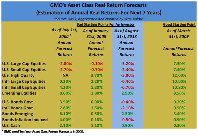
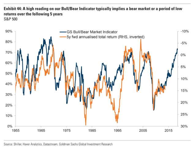
Clearly, I have been bearish on bonds, and U.S. equities too, though so far this has been very wrong with regard to the broader U.S. equity market, though I still think real returns going forward are going to be the worst in modern market history as shown by the table I regularly put together below using data from GMO (first table below), and corroborated by Goldman Sach’s (GS) Bull/Bear Market Indicator (second chart below).

What could cause these poor projected real returns?
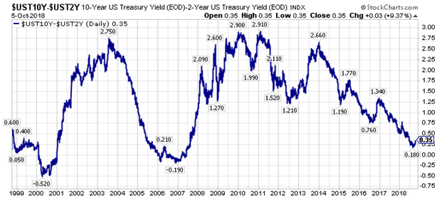
One answer is rising interest rates, and ironically higher economic growth, as faster economic growth puts upward pressure on inflation and interest rates, particularly at the longer-end of the yield curve, which has remain stubbornly subdued compared to shorter-term interest rates, as shown by the chart of the spread between the 10-Year U.S. Treasury Yield and the 2-Year U.S. Treasury Yield.

Looking at the chart above, we are clearly early in the steepening of the yield curve. In fact, the upturn only looks like a blip. However, in percentage terms, we have already exceeded the steepening in late 2016, so there may be more to this developing story than meets the eye, especially with the correlated turn higher in longer-term interest rates across the world, including in the United States, Britain, Germany, and Japan.
“Lower for longer” has been a mantra for a long time applied to interest rates, but what if after nearly a decade of a flattening yield curve, longer-term interest rates rise more than almost everyone expects right now?
What would that do to current asset valuations?
Where are the risks in an environment where almost all investors have been chasing yield for over a decade?
Where are the opportunities?
In closing, it is my opinion, that there are many extremely crowded trades, not to dissimilar to past major inflection points in the market that we have collectively witnessed as market participants over the past two decades.
Active investors, particularly value investors, have been punished severely the past decade, however, this pain (and I have endured my fair share or more) is setting up an extraordinary opportunity as price discovery, long cast aside by the indexing/ETF wave, reasserts itself with a vengeance.
Best of luck to everyone,
WTK


